I thought it would be an excellent opportunity to go in depth (in laymen’s terms obviously) into the science behind color and how it can help you with your crafting projects.
Let’s begin with a nifty quote that explains it better than I ever could:
In the visual arts, color theory is a body of practical guidance to color mixing and the visual effects of a specific color combination. There are also definitions (or categories) of colors based on the color wheel: primarycolor, secondary color and tertiary color.
Thanks Wikipedia.
Now, we know that if we’re working with fabric that we aren’t mixing our own colors; unless you are a fabric dyer extraordinaire…(that, actually sounds like tremendous fun). But, we are consciously attempting to create visually stimulating work.
The area of color theory that I want to focus on, is the idea that we can create a certain effect by merely being strategic about color choice.
If you look at this Color Wheel below you will see the key to the right pointing out the Primary, Secondary and Tertiary colors. Basically, the story goes, that you cannot produce the primary colors by mixing colors. But that all colors are produced by using a combination of them.

Fun fact: Color Theory (as far as we know) was first discussed by Leonardo Da Vinci and Sir. Isaac Newton.
If we continue to study the color wheel, you will notice that if we drew a straight line from one color to the other side of the circle it will bump into another color. This, my friend, takes us into the world of Complimentary Colors and Harmonizing.
In color theory, color harmony refers to the property that certain aesthetically pleasing color combinations have. These combinations create pleasing contrasts and consonances that are said to be harmonious. These combinations can be of complementary colors, split-complementary colors, color triads, or analogous colors. Color harmony has been a topic of extensive study throughout history, but only since the Renaissance and the Scientific Revolution has it seen extensive codification. Artists and designers make use of these harmonies in order to achieve certain moods or aesthetics.
Thank you again Wikipedia.
So, every color you see on the wheel that connects to another on the opposite side is its complement. The stark contrast between the two colors creates the strongest visual tension and therefore grabs the most attention.
Here’s an example:
Let’s go a level deeper.
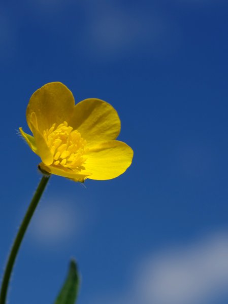
Split-Complimentary colors create a similar effect, but splits one of the true complementary colors into two similar colors. It would be like if we took that picture of the pretty buttercup with the bright blue sky and made the top half of the sky a Blue Green and the bottom half a Blue Violet.
Basically, if Blue had a baby with Green and then had another baby with Violet.
The point of this technique is to achieve color harmony by mixing things up visually. it makes things a little more interesting.
The late Vincent Van Gogh loved to do this:

Are you feelin’ the harmony? It has a certain vibrating quality and liveliness.
“Instead of trying to exactly paint what I see before me, I make more arbitrary use of color to express myself more forcefully.” – Vincent Van Gogh
Okay, this post has gotten away from me, and I will have to post a Pt. 2.
In the next post we will explore Color Polygons and Analogous Colors.
Did you guys find this interesting? I love this stuff.
In the mean time, I’d love to hear about your color theory experiments 🙂
Until next time..


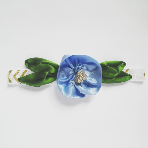
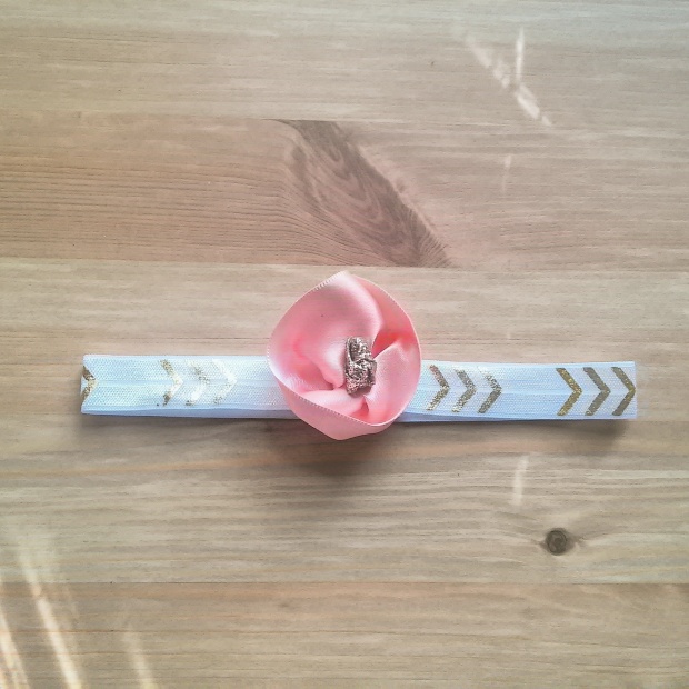
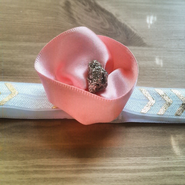
 This headband features 12 inches of ribbon all rolled into a pretty bow. The center is secured with a white and gold celtic knot. I’ve paired it here with a soft gray elastic and the bow measures approximately 5″ across.